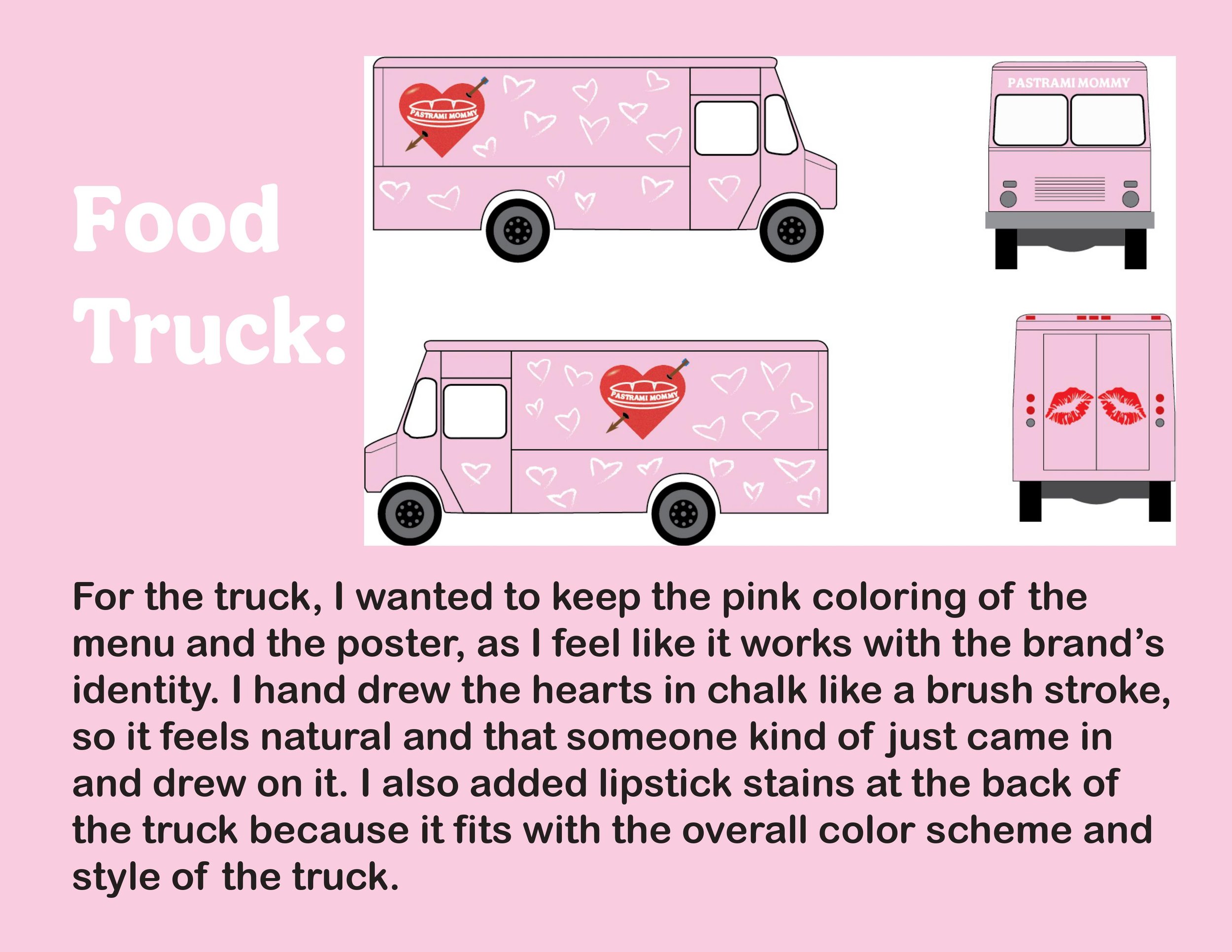
For this project, I made a food truck that specializes in sandwiches. Below are the menu, truck, logo, and brand guides. I chose the heart-shaped logo to make it feel like those mom tattoos so that it would be a memorable logo that people can recall.

I wanted to make the truck look inviting, so the soft pink and the hearts that look like chalk make the guests feel warm and childlike again.

The menu is plain and simple, classic sandwiches with our own spin on it.

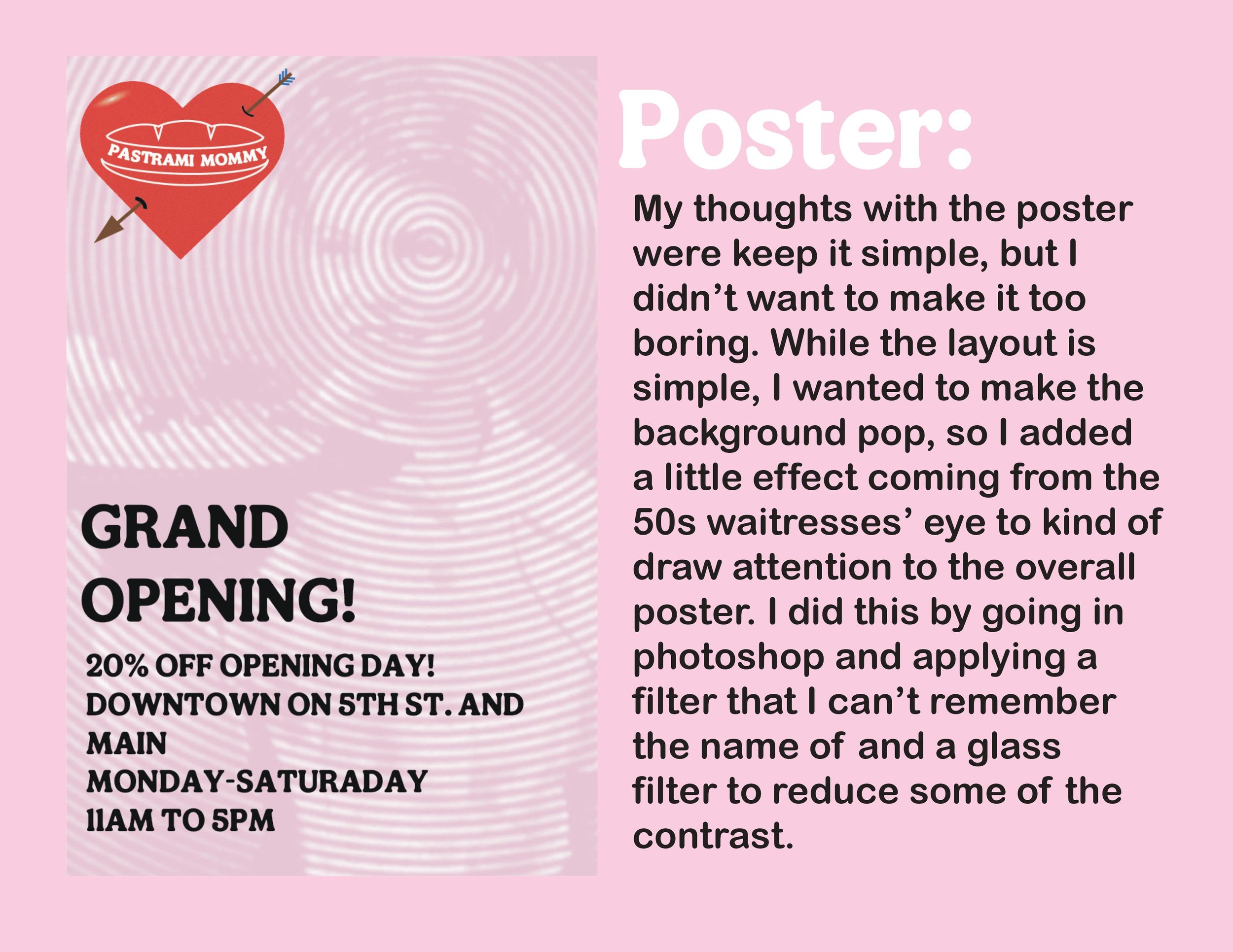
For the grand opening we will be putting up these posters around town to help grow awareness.

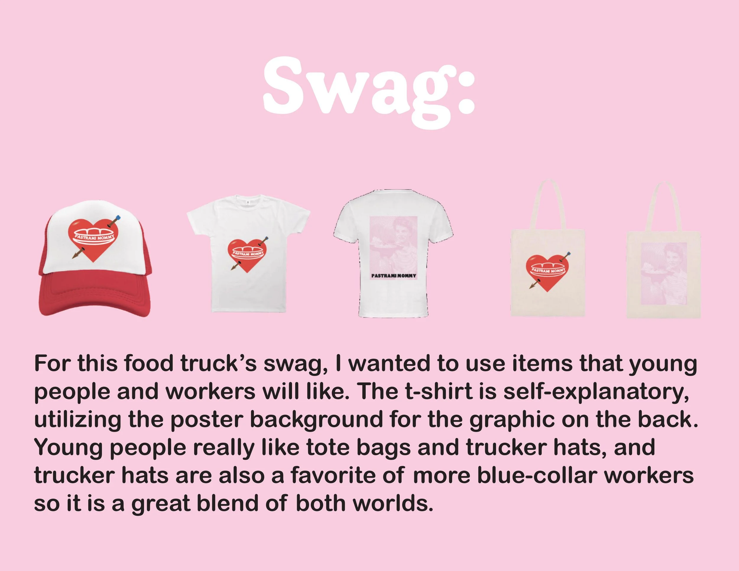
Who doesn't love a good tote bag?

Trucker hats are in again, and this stylish hat will grow earned media around town.
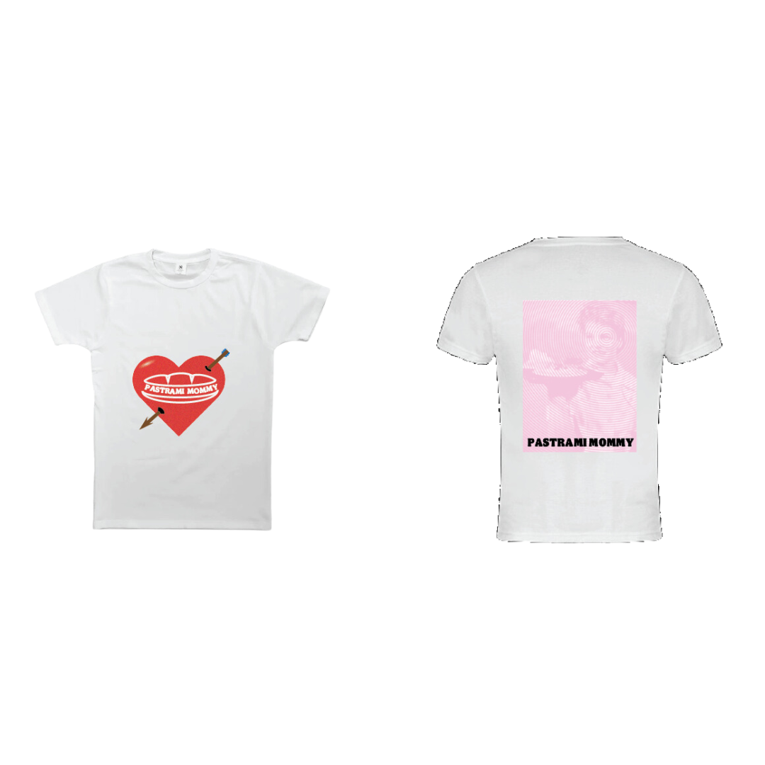
And of course we will be featuring t-shirts to also help gain earned media